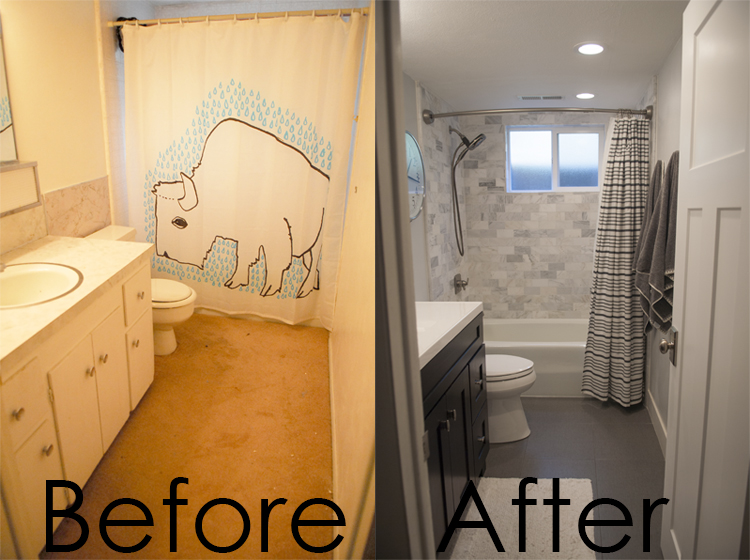
 When you are buying a house and walking through it for the first time (or even the 3rd time) do you ever find that you are just blind to certain things?
This bathroom was one of those things. The house was more than 3 times the size of the house we were desperate to move out of. When it came to the basement I felt like it was all just bonus space. I was so over the moon with the living room and the spacious windows and amazing studio space for me that I totally just turned my head to the gross, dark and old bathroom. (seriously so gross) So when we finally finished phase two of the bathroom renovation it was probably the most dramatic change.
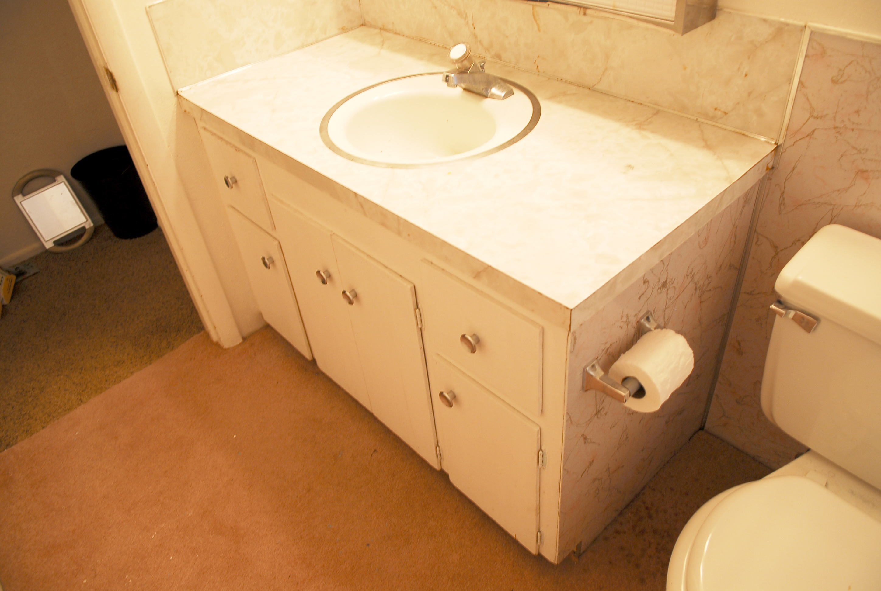 These pictures are what the bathroom was when we moved in. The awful laminate surround and counter was old and dated. The cabinet drawers were hard to open, and the wood was mostly warped from a leaking sink. So much fun.
 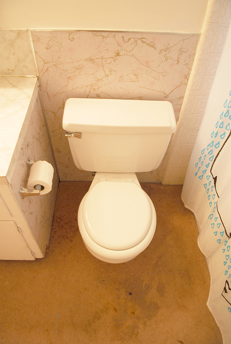 This floor right here. This faded pink carpet that is stained and gross and smelled like pee, is the reason no one should EVER (ever) put carpet in a bathroom.
 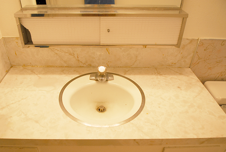 The cabinet above the sink was cracked and broken and it was basically unusable as well.
  It should also be noted that the lighting in these photos is accurate to how awful the bathroom lighting was, and how yellow the once white walls had become.
  This bathroom was a scrape it down to the bones project. The only thing worth saving in this bathroom was the bathtub since it was an old cast iron tub in excellent condition. Everything else however, had to go. We did the bathroom in 2 phases, as we did with most of the house. Phase one was to replace everything needed to make the bathroom functional until the rest could be done. This phase happened shortly after moving in. We ripped out the gross carpet, and replaced it with tile. Put in the new cabinet and new toilet and then repainted. We also scraped the popcorn of the ceiling and retextured the ceiling.
 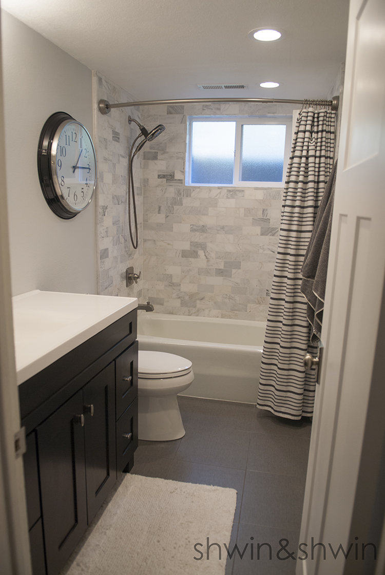 With phase 2 we had the shower re-tiled with the same tile guy who did the upstairs bath. We put in a new window at that time as well, fresh paint and new decor. The curved tension rod for the shower is great because we wanted a curved rod but we didn’t really want to drill holes in our brand new tile. Canned lighting was also installed and it made a HUGE difference. Canned lighting is making its way through every room in our house because it makes such a difference. Like night and day.
 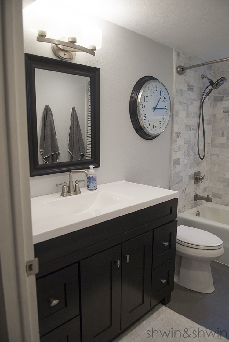 For this bathroom unlike our upstairs bath we did most of the work ourselves. The cabinet was a box set from lowes so it was easy to swap out for the other cabinet, we tiled the floor with a friend, and the rest was fairly easy to do.
 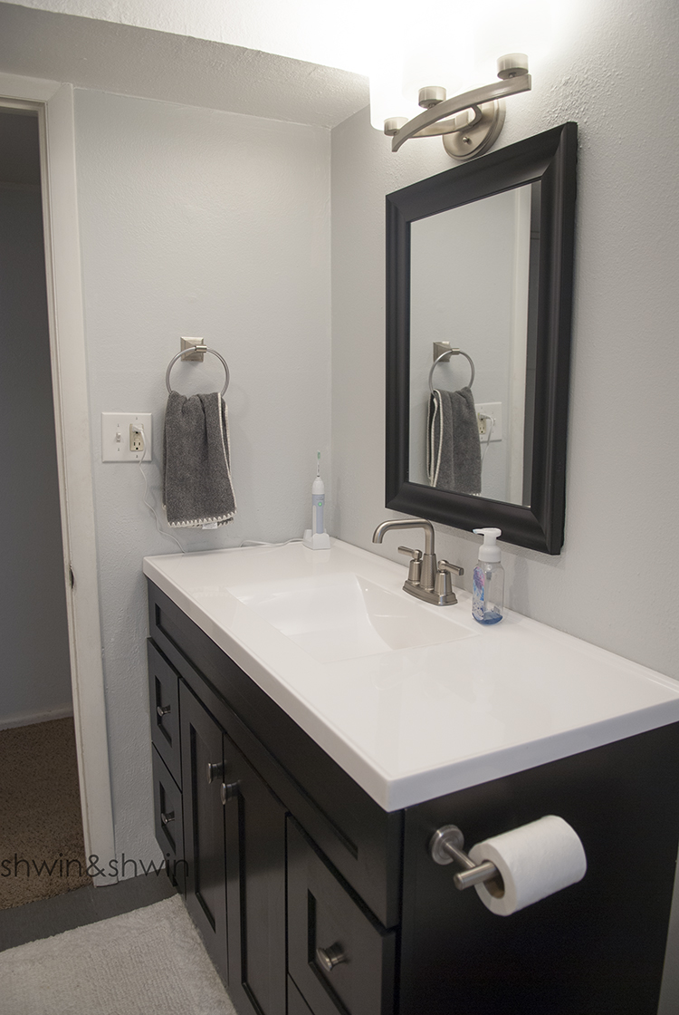 This bathroom is primarily used by our son, but it’s also the guest bathroom for the guest bedroom in the basement. When we were designing the bathroom I wanted it to be masculine for our son, but still a modern and friendly place for guests. I didn’t want it to be overly childish, even though those types of bathrooms are cute kids out grow those themes so quickly and I really wanted this bathroom design to last. Ultimately we decided to go with a black and white theme. This is unlike our usual design choices, but I really love the way it all came together.
 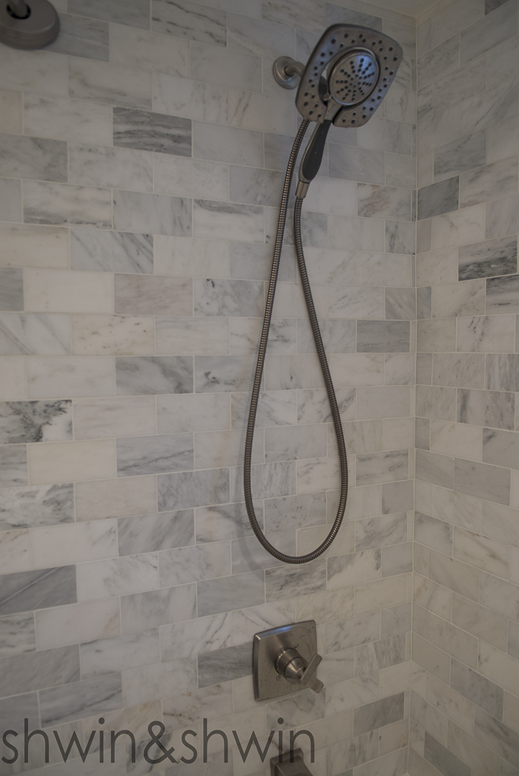 The thing that really ties the bathroom all together is the carrara marble subway tile. I knew I wanted it in the shower, we just weren’t sure if we were going to do an accent wall or some other design detail with it. I am glad we went with just the marble tile since it makes enough statement on its own and it looks so great and classic. The faucet is a shower head and hand held in one, our plumber had recommended it and we like the way it looks in get space and having the hand held part is really handy when you have kids and pets.
The bathroom is such a dramatic difference and its so great to use now.
The products we used:
- Wall tile
- Floor tile
- Cabinet
- Counter
- Sink Faucet
- Tub Faucet
- Shower Curtain
- Shower Curtain Rod
- Towels
- Rug